Polish & Environmental Design
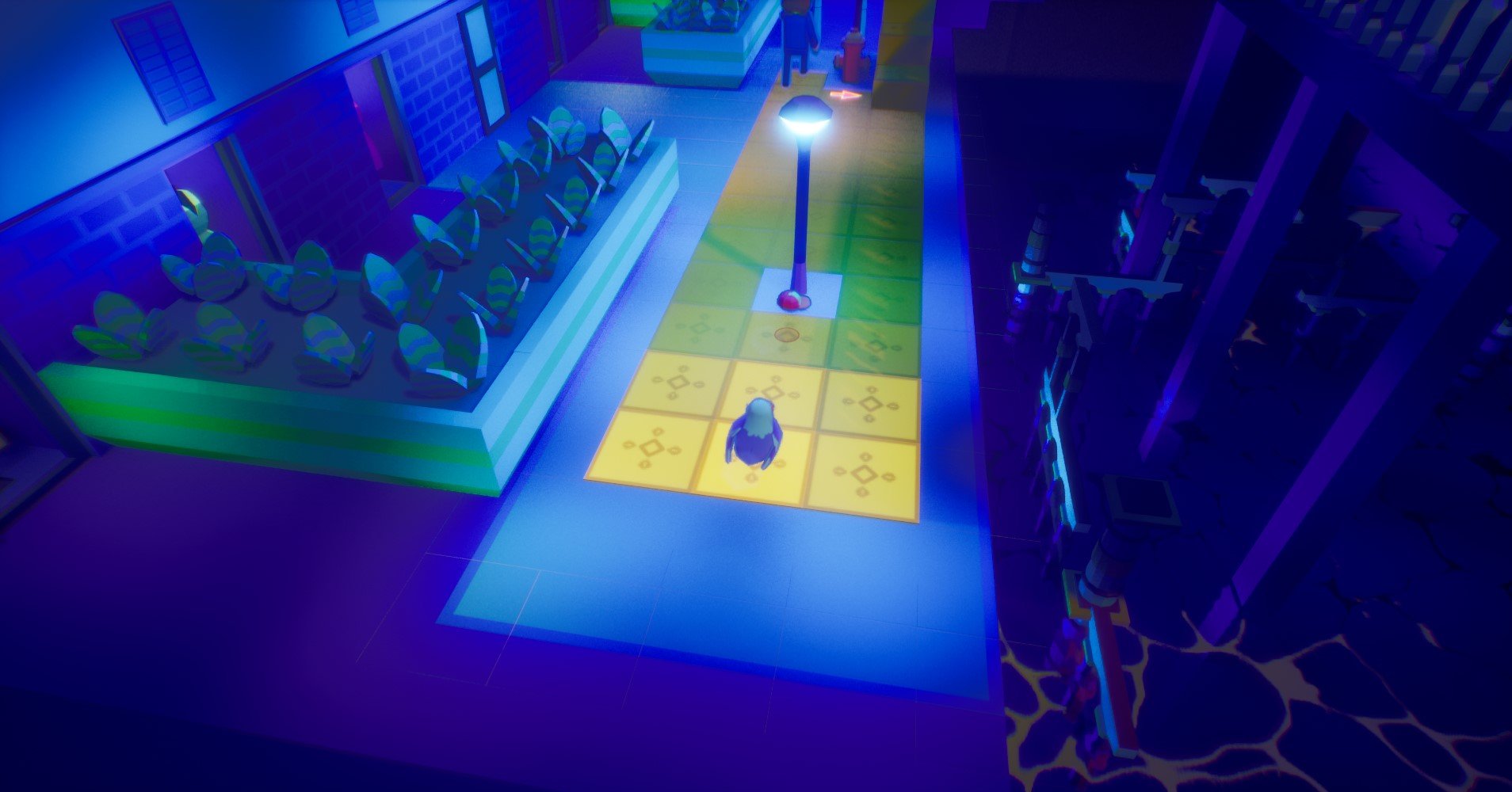
Since January we started working on placing the assets in the levels while polishing specific details of the levels. We did several iterations of how the levels would look, working on things like the lighting, the color palette or the placement of the assets. Some of the changes we made were made due to personal preferences while others were made to make the game more clear. We tested the game with the new visuals with other players and from there we got the feedback for the visual changes, but also we kept discovering areas that could still be polished. That’s why some levels kept receiving changes well after the assets were placed.
Regarding the color palette we struggled a lot as sometimes we found a combination of colors that created the look that we wanted but also made gameplay more difficult. Other times we found one that worked but was boring or didn’t transmit the feeling that we wanted. It is very likely this took us so many iterations because neither of us is experienced in color theory. Still, with the help of an artist friend of ours we managed to nail down a color palette that created the vibes we wanted and improved the gameplay. It is composed of two color palettes, one for the background and less important elements and one for the important ones. The former is composed of different blue tones that create a moody atmosphere of walking in the night. The latter is a more diverse palette with more vibrant colors which we used to create points of interest as well as create the vibe that the night is alive with neon colors.
I think that something that is important to state clearly is that the environmental design, beyond existing for aesthetic purposes, is an important tool to boost the base level design. One example would be using contrasting colors or using lights and shadows to call the player attention to certain areas while ignoring others. Another would be creating easily recognizable spaces to help the player create cognitive maps of the level to maintain orientation.
A task we have been working on related to this objective was creating new assets and polishing old ones. At some point we realized that the levels looked to samey and decided to spend some time making new assets. This time I took on the bulk of the 3D modeling work as my partner was busy working on polishing the game feel from the code front. We could take this decision without much worry as early on we decided on a simple 3D aesthetic, texturing process and a small color palette. This doesn’t mean we don’t care how the game looks, quite the opposite, but we knew our limitations and decided to work around them as innovatively as possible. That's why we have redefined the color palette so many times and why we are making such a big effort with the lights and technical effects in the game.
Now that the asset placement and color palette are pretty much done we are going to focus on UI and adding visual effects where we feel they are missing and removing any we feel might be unnecessary. Also, we plan on doing some more tests with the newly improved levels and new visuals to test how much the player experience has improved.


